As a technology company we love working on big and exciting new features like Auto Photo Capture and WaiverSync. We get downright giddy determining which features are needed, digging into the code and figuring out the best way to present everything and then finally announcing what we’ve been working on. Exultation!
What is equally exciting and rewarding (but perhaps celebrated with a little less fanfare) is when we roll up our sleeves, look under the hood and work on all of the little things that can make the digital waiver more user friendly and aesthetically appealing.
Below are a just a few of the dozen improvements to the digital waiver that we released today:
A Sleeker Look
We rounded some corners, added some drop shadows and sectioned the waiver to make it more readable for participants.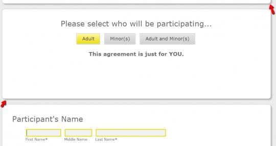
A Better User Experience
We’ve added an animated demonstration showing what the participant should do when they get to an initial or signature box on your waiver. The message will change depending on whether the participant is using a mouse with a computer or their finger on a tablet.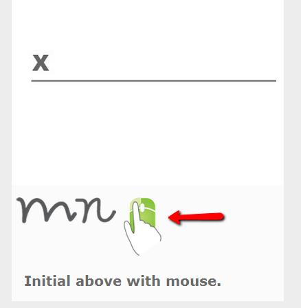
A Cleaner Looking PDF
We cleaned up the PDF that is generated with every signed digital waiver and improved the way in which the waiver is printed in portrait orientation.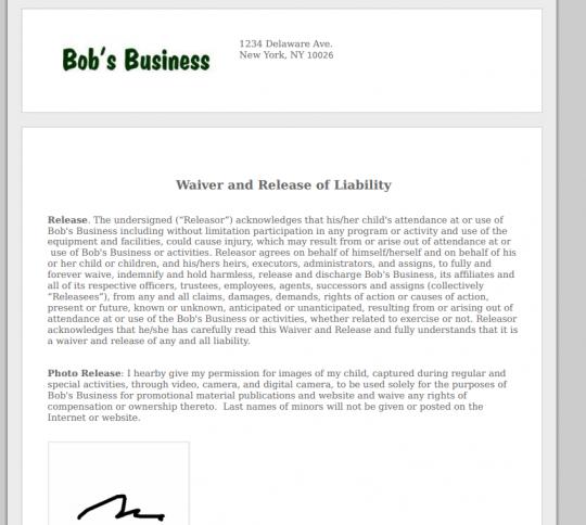
A Cleaner Smartphone Presentation
We made a number of improvements to the way digital waivers are presented on smartphones, making for a much more intuitive signing experience for participants.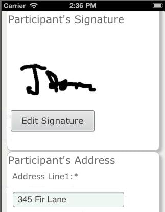
We hope you and your customers enjoy the improvements. We’ll continue to look under the hood and seek ways to enhance the user experience for your customers.